8 Best practices for designing dashboards with Qlik Sense
In addition to data reliability, a Qlik Sense dashboard must be well constructed if you want your users to adopt and use it fully. In this post, we will discuss the 8 best practices for building an effective dashboard with Qlik Sense. These are good construction and design practices.
A great dashboard’s message and metrics are clear, its color enhances meaning, and it delivers the most relevant information to your audience.
1- Know your users
The best dashboards adapt perfectly to target users and their usage habits. You don’t design your report the same way if your user is a busy salesperson who has very little time to view their KPIs and sales results. Or is it a Marketing team that needs to analyze data in depth to understand customer behavior.
It is also important to take into account the level of users to use the dashboard. Are the users autonomous to read and analyze the data, are they comfortable with filters and bookmarks?
Identify your users’ priorities and understand how they view the data to determine how you will present the data.
2- Consider display size
Related to the first point, you need to know how your users view their dashboard. If they are viewing their data from a tablet or phone, you need to factor in the screen size in the dashboard design to provide a better user experience.
Highlight the main KPIs, because users won’t be able to dive into the details on a small screen. When you create dashboards for phones or tablets, display only the main measures. You must therefore provide components with a low number of interactions and easily accessible.
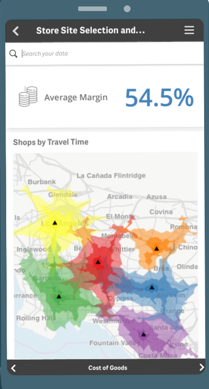
Design your content for vertical display to fit small screen phones: most people use their phones in portrait mode. So give priority to vertical optimization.
Even if Qlik Sense manages the layout of objects dynamically, this does not mean that your visualizations will be easily readable by users.
To check the appearance of your dashboards on different devices, you have several options:
- Change the size of your browser
- Use the developer tools of your browser to simulate a device (iPad, iPhone, …)
- Use a phone or tablet
3- Make it quick to refresh
The user experience will be bad if your dashboard takes a long time to display the data. Slowness can come from several factors: undersized infrastructure, use of a lot of data, bad modeling, bad practices in the development of charts and tables…
It should be ensured that each of the elements listed below is optimized. Make sure that the machine on which Qlik Sense is installed has sufficient resources (CPU and RAM) allocated for Qlik Sense. Preferably, install Qlik Sense on a dedicated machine in order to benefit from all the resources.
The slowness of an application can also come from the fact that the application contains a very large number of data with regard to the capacity of the machine. Qlik Sense works by default with In-Memory technology, so all the data is loaded to RAM.
Poor development can also lead to poor performance. Make sure your data model and expressions are optimized. Precalculate your measures as much as possible to prevent Qlik Sense from re-evaluating the measures on each interaction.
When your application begins to be large, ask yourself the question if it would not be more relevant to create two or more applications per area of analysis. This will allow you to have smooth and simple applications with a reasonable number of visualizations.
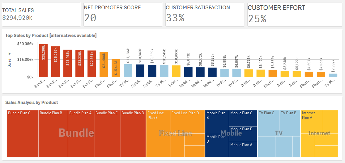
4. Choose the ideal location
When users view a dashboard, they always start by looking at the indicators, starting with the content at the top left.
Therefore, it is important to put the most important chart in the upper left corner.
When designing your dashboard, identify the elements that make up logical groups and bring them together in a single sheet, to guarantee a certain fluidity.
In addition to organizing your sheets by logical groups, always start with the sheets which contain high level indicators then those which contain detailed information.
You can also highlight the filters most used by users of the application so that they can easily make the most common selections.
Also think of viewing your dashboard on other media such as PDF or the body of an email. Users often need to manually export a sheet to PDF or subscribe to a Qlik Sense sheet or application using the extension Qalyptus Notify.
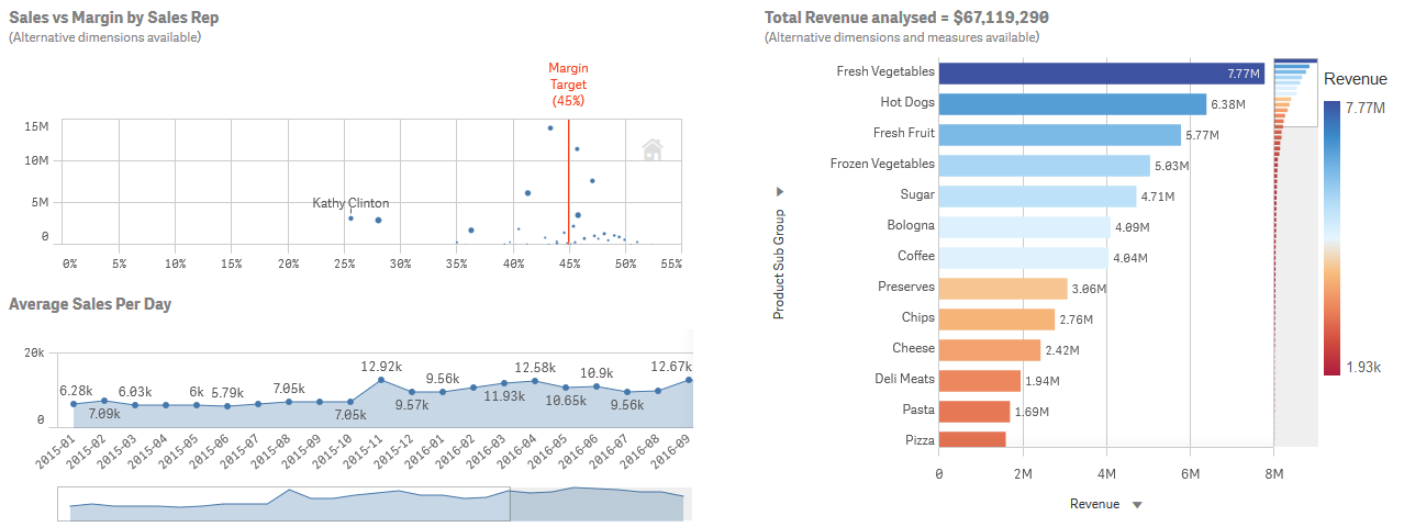
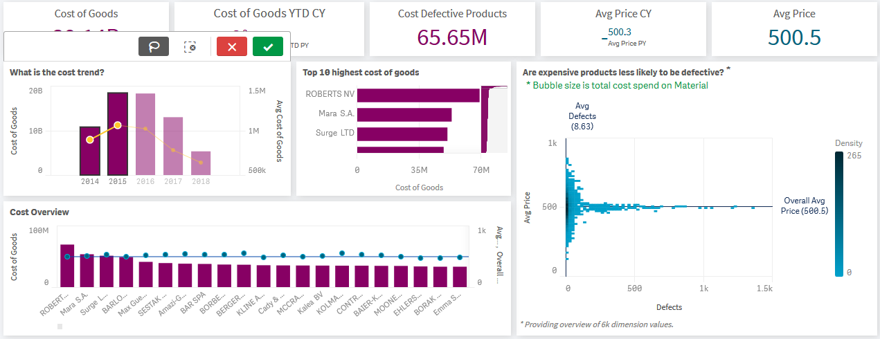
5- Limit the number of charts and colors
A dashboard with several sheets that contain many charts is a dashboard that risks drowning users in a lot of information without highlighting the most important information.
If you feel that your application requires several graphics to cover the entire perimeter, I advise you to create a Story. It is a sequence of visualizations and texts that present information to users. The most autonomous users can always create other visualizations themselves.
The same goes for colors. If used correctly, they can enrich the analysis. If there are too many, this results in visual overload which slows down the analysis and may even make it impossible.
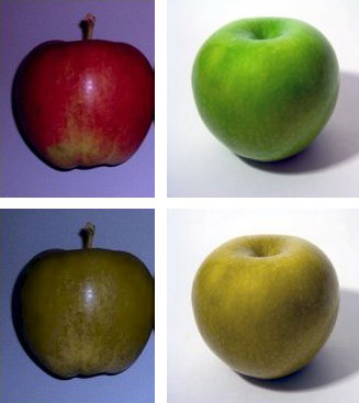
Who says color, says color blindness. Worldwide, an estimated 300 million people are affected by color blindness. A disease that affects how a person perceives colors. Make sure your users distinguish the colors.
Here’s what a person with color blindness sees. At the top of the picture two apples: red and green. At the bottom of the picture, a simulation of the vision of these same apples by a colorblind person.
In conclusion, avoid adding unnecessary objects with ill-suited colors that prevent your dashboard from quickly informing your audience.
6. Encourage exploration using scenarios
Unlike traditional BI tools, Qlik Sense allows for interactive and comparative analysis. This analysis is possible thanks to the possibility of filtering the data by selecting dimensions in the charts. It is therefore recommended to set up analysis scenarios. For example, you can have a graph at the top of the sheet act as a filter for other graphs.
You can also display filters for different types of data. For example, offer filters with multiple or unique selections. You can dynamically change the title of the charts according to the selections.
7. Use a theme to standardize your applications
The visual aspect of a dashboard is very important, it helps to facilitate the adoption of the dashboard by users. It is recommended to use a Qlik Sense theme when creating your applications. Preferably use a single theme in order to have homogeneous applications that do not change the users’ experience.
In addition to colors, a theme consists of the logo, Typography (font policy) and graphic elements / icons / pictograms.
Here are two versions of the same Qlik Sense sheet with two different themes.
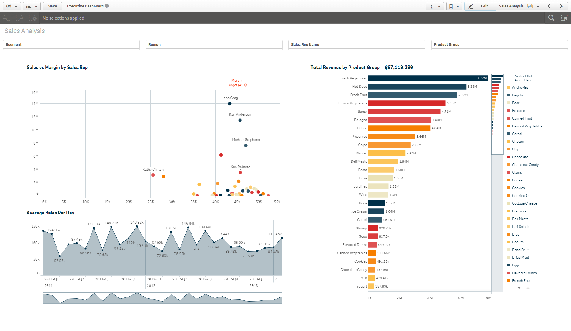
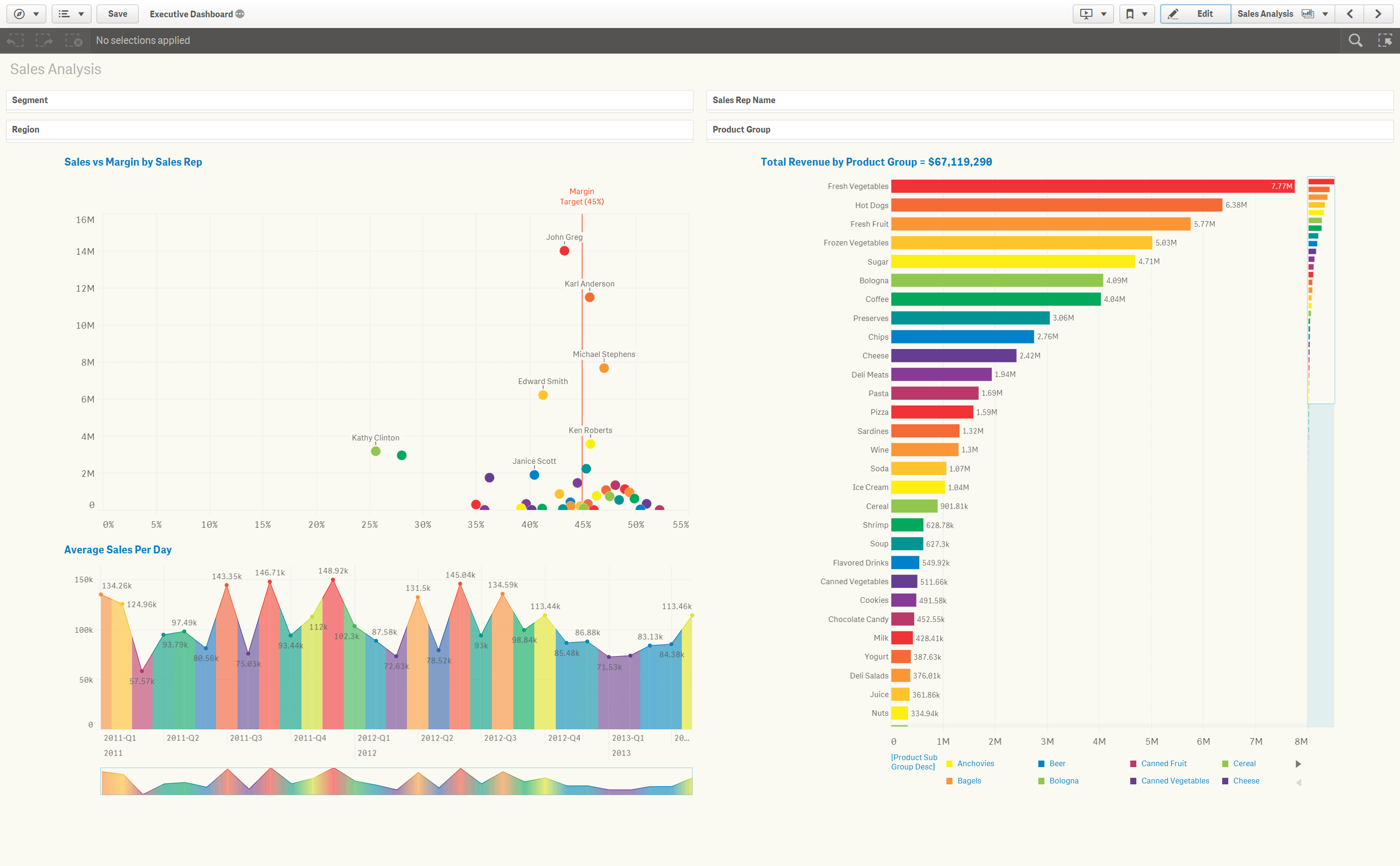
Using a theme allows any document from your company to be identified at first glance. If you use the same theme, your image will always be the same regardless of the support and your users will easily adopt the new applications.
To create a theme, I recommend using the theme editor created by the Bitmetric team.
8. Test the ergonomics of your dashboard
It would be a mistake to stay until the end of the project to ask the opinion of your users on the dashboard. It is important to validate by the users each of the sheets of your application throughout the development cycle.
Depending on your organization, feedback on your dashboards can be carried out by a key user, all users of a service or a product owner.
This will save you time by avoiding possibly reviewing all the elements of the dashboard at the end of the project. This also helps to ensure that users will adopt the dashboard, because it exactly matches their needs.
Consider sharing this article!